Improving Application Transparency on Indeed’s Mobile App
My Role: UX Apprentice | Project Duration: 2 Weeks
Introduction
With The Great Resignation of 2021, professionals of all ages turn to job searching apps to find a new direction in careers and life. It is no wonder, then, that General Assembly tasked its February cohort of UX Apprentices to design a feature that will help these job seekers — specifically on mobile.
This article walks through my process of designing a new feature for the Indeed mobile app to increase application transparency for job seekers. Through research and sketching, I landed on a feature for employers to include estimated application response time in their listings, plus an ability for job seekers to filter results based on the response time. Let’s get into it.

Research Process
Before we begin designing any new features, we need to understand how users currently approach job searching. Thus, we started with a simple question:
How do users approach job searching on mobile apps?
With this question in mind, my team and I crafted a series of questions to start understanding the highs and lows of current application processes. We knew from the jump that conducting user interviews would allow us to quickly gather tailored information to this task. We ensured to interview users who have job searched in the past few years to attain relevant data. Besides gathering background and demographic information, here are a few questions we asked:
Can you tell me about the most recent experience you had job searching?
Can you tell us what resources you used during your job search?
How would you find updates on the status of your applications?
We saw trends pop up early on in the interviews, like the majority of users relying on LinkedIn and Indeed. To truly make sense of the interviews, we needed to synthesize our data. To visualize trends and pick out key insights, I turned to affinity mapping.

Visual representation of our affinity mapping, using sticky notes for observations made during user interviews.
Here are some standout quotes attributed to sticky notes seen above:
“I had no way to check on the status of my applications.”
“I would have to use my own records to track applications.”
“I would save listings on mobile to apply later on desktop.”
Understanding User Interviews
Affinity mapping helps us thread together common themes found from our user research. Our interviews led us to 6–7 main categories, from the sites they use, features they enjoy, and how they use mobile in their search.
Looking at these groupings, we can further distill and synthesize the research to personalize and empathize with our users. I did this through the use of “I statements”, attached to each of the groupings. At a glance, these statements provide insights into how users are approaching our subject of study. “I want to stay updated on the status of my applications,” is an easily digestible piece of information to use as we design forwards.
Key Insights from User Research
After studying our user research, with the help of affinity mapping, I extracted several key insights to inform my project.
People aren’t applying through mobile applications because of how much time it takes.
Users rely upon a number of external tools from job-searching sites to keep track of applications.
Users have a hard time staying updated on their application status after applying.
Users use a number of different sites to find jobs.
Users are more likely to apply to jobs when referred by someone in their network.
Great, now we know that users struggle to keep track of jobs and mostly use mobile apps for browsing and searching. We also saw from our interviews that Indeed was a commonly referenced tool, which tells me it is a good choice to focus on going forwards.
These insights are vital to the next step of our process: developing a persona.
Introducing Our Persona
I took the key insights from our user research and personified them into a relatable persona — Joel J. Creating a persona keeps my work user-focused by reminding me of how a “real” user would react, interact, and feel about my designs.
The most important aspects of the persona relate to his needs, goals, and frustrations. These details keep my design centered on where, how, and why Joel is using Indeed.
Combining Joel’s needs, frustrations, and scenario helps me create a problem statement:
Joel needs clear job application timelines so that he can better manage his time and expectations while job searching.
The Problem and How to Fix It
Our problem statement created with the help of Joel helps us frame potential solutions. We call these potential solutions “How Might We” statements, used to generate creative ideas for helping our persona.
Based on Joel’s needs, frustrations, and problem statement, I came up with three “How Might We” statements:
How might we remove the guesswork of job application timelines?
How might we connect job listings and applications to digital calendars?
How might we make mobile application experience more interactive?
For the timeline of this project, I needed to focus on just one of these statements. Before I picked the one to begin designing, I created user flows to help me make a more informed decision.
User Flows
I first created a user flow of the existing process within Indeed mobile app to get a sense of how users operate on the platform. This acted as a rough draft for me to think of where to implement potential new features.

I used this rough draft to create another, longer user flow — more tailored to how someone might be searching, filtering, and applying on the go.

A more in-depth user flow that Joel might go through using the Indeed mobile app. Potential new feature additions are seen in green.
Creating this updated user flow helped me decide the feature I wanted to implement. Since Joel mostly uses his Indeed mobile app to casually browse job listings, it made more sense for me to pick a feature earlier in the flow than a feature that comes in at the end.
Thus, I officially decided on my new feature: Application Response Time — a way for employers to better inform job applicants of the timeline after applying to a job. Time to get designing.
The Design Process
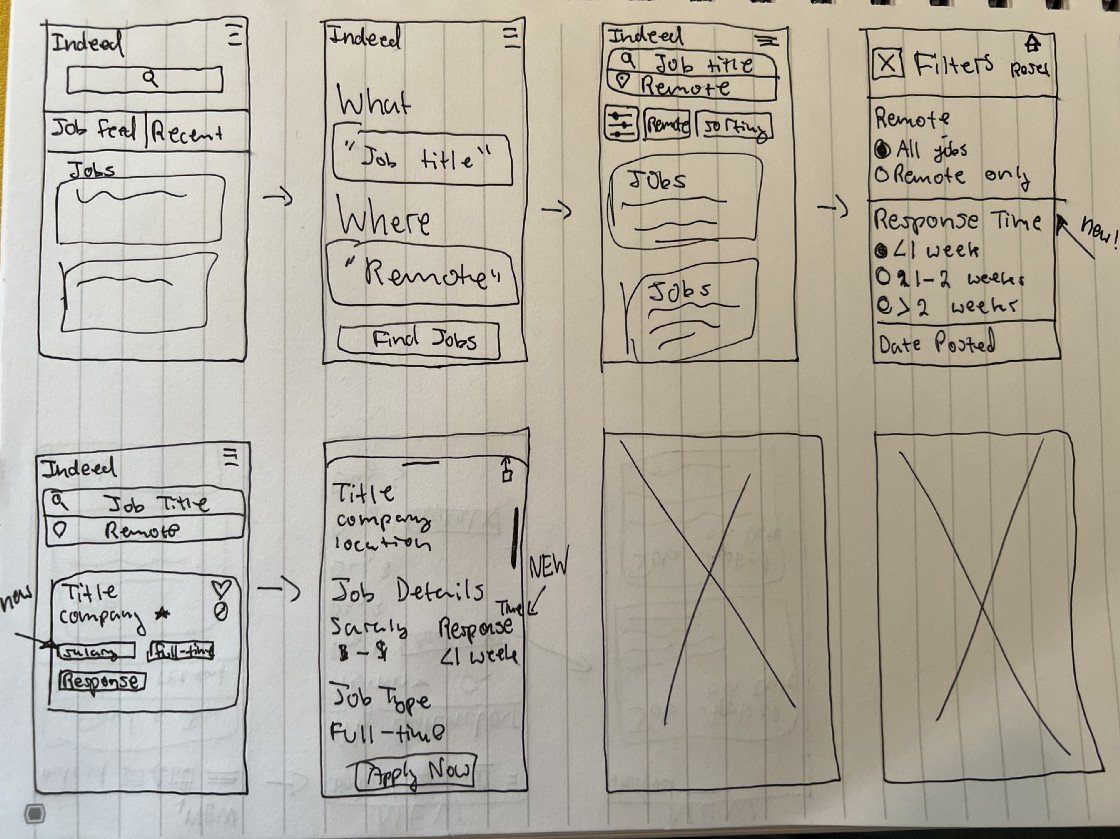
Six sketched frames of the Indeed mobile app implementing the new feature.
Sketching where I wanted to implement my new feature helped to visualize places in Indeed I could seamlessly integrate it without disrupting the current visuals. It was important to me that the feature could easily be viewed on job listings since Joel scrolls casually and often. The next important feature was a filter, so Joel could narrow down his results.
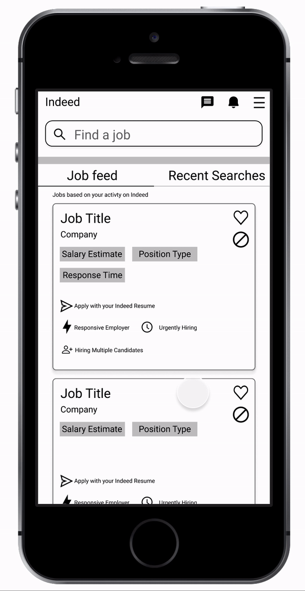
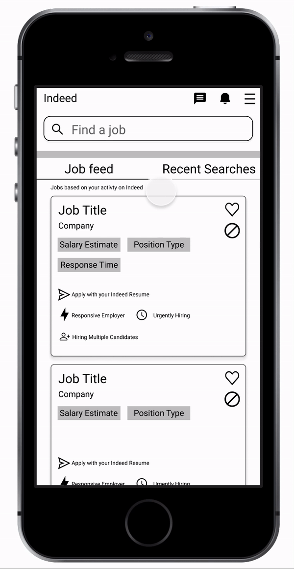
Happy with my initial sketch, it was time to digitize. Using Figma, I created greyscale wireframes of my earlier sketch.
Initial wireframes with green circles indicating the new features.
After creating all the necessary wireframes, I turned them into a working prototype that I could use for usability testing. To me, the prototype felt perfect, of course — but as a designer, I know that testing will reveal any faults to be improved. So let’s get testing!
Usability Testing
To make sure the feature I designed worked and resonated with users, I conducted usability testing on my prototype. I created a primary task to assign all my users: Find remote, UX designer jobs that will respond to your application in under a week.
To further improve my design, I had a secondary task for my users as well: Change your results to show jobs that will respond between 1 and 2 weeks.
I wanted to make sure navigation between the different filters remained seamless should a user want to make changes.
To extract meaning from my testing, I needed to establish clear goals for my tests. Based on my own interaction with the prototype, my goal was to have users successfully complete the task in under one minute with zero misclicks.
Emotions are an important part of our users, too, so I would also ask questions about how they felt about the feature and overall impressions.
Here you see the example flow the users should complete in their testing.
Usability Testing Results

Results from the four users we tested. Green represents scoring within the bounds of our goal, red indicates they didn’t meet the goal.
The initial results showed that users completed these tasks successfully and (mostly) well under the time limit. However, there were some common errors being made in the primary task. Users struggled to click the filter option because the hot spot to select the filter was so small (you had to click right in the middle of the circle).
When discussing afterwards, users pointed out that “Sort By” as a filter category title would be confusing if they did not already know their task.
The second task was very successful, except for one user who felt he should be able to toggle the filter from the top navigation bar rather than going back to the filter menu.
Design Iteration Based on Testing
Taking this feedback, I implemented changes to the prototype. I created a much larger hot spot for the filter options so that a user could click on a larger rectangle around the text. I then changed the copy of “Sort By” to “Application Response Time”. Finally, I allowed users to toggle between different application response time filters from the search result page. View the changes in the recording attached!
Final Thoughts
Moving forwards, I would recommend looking into other solutions that could solve our previous “How Might We” statements.
My first suggestion is to look into ways to integrate Indeed with external calendar apps (Like Google Calendar or iCalendar). Alternatively, Indeed could also have an internal calendar that keeps track of what jobs a user has applied to and when. This feature could make use of the estimated application response time by indicating the timeframe a user can expect to hear back from a listing. Both of these features will assist the user in understanding post-application timelines.
Thank you for reading through my research and design process of creating a new feature for the Indeed mobile app.
Disclaimer: This is a personal project for coursework with General Assembly’s UX Design Immersive.